David X Levine Gets Personal at Eight Modern
An exhibition of drawings by David X Levine opened October 19th at Eight Modern, the gallery’s second show of his work. The first, She Kept Her Heart Parked On A Hill, which paid homage to music of the 20th-century, happened in 2010. Using Levine’s signature colored pencil on paper, She Kept Her Heart Parked On A Hill showed bulbous shapes that escaped anthropomorphizing save a cheeky personality hidden within the meticulous Prismacolor strokes. Miles (2007) uses two colors: tan and brown. The background is tan and the brown bulging oval takes up almost half of the picture plane. Although the drawing is completely flat, this brown mass rests off-center somehow resembling a sitting portrait model. Assumedly referencing Miles Davis, Miles leaves this small anthropological token to the musician.

David X Levine – Miles
In Levine’s new show his work flattens the plane even more, entering the realms of minimalist geometry. Levine’s drawings still rely heavily on music for their direction, evident in pieces like Blind Clapton (2011) where three boxes sit on top of each other against a bare white background. The bottom is the smallest—a black square, then a sky blue large vertical rectangle stacked on top. The third is a yellow rectangle sitting sideways. The totem is top heavy but the boxes aren’t aiming to be structurally sound. They are three colors with crisp edges. What this picture has to do with Eric Clapton is evasive.

David X Levine – BLIND CLAPTON
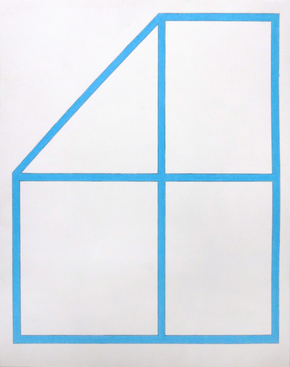
This is the case with the whole show. The titles are so intentional, so deliberate, and yet their connection to the image is a mystery—except to Levine perhaps, whose dedication to humans and their craft is made obvious in these titles. Drawings like Anna Kunz, John Haro, Jonathan Lasker, Kevin Fallon and so on are all artists and assumedly friends of Levine. John Haro is 14 x 11 with a sky blue geometric form. Six lines fill the paper, delineating the space like a windowpane. Jonathan Lasker is 14 x 8 with five different colored horizontal bars evenly spaced down the vertical piece of paper. It looks like a Donald Judd sculpture except small and on paper. Levine’s hand-colored shapes are meticulously filled with thousands of scribbles of Prismacolor pencil, turning their geometry into an act of repetitive devotion. So how does Jonathan Lasker the drawing represent Jonathan Lasker the man?

David X Levine – JONATHAN LASKER
Kevin Fallon (2012) poses the same question. It’s 14 x 11 with five blue horizontal bars stacked on top of each other. In between these bars are six shorter and narrower bars in orange, red, pale green, light brown, yellow and pale blue. All the rectangles are pushed to the left side and the negative white space that remains is like a squared comb. Whether intentional or not, the composition looks like colorful piano keys. His artist bio insists that “many of his pieces are inspired by specific songs,” but the primacy of music in Levine’s drawings is ambiguous except when explicitly referenced in titles such as Blind Clapton or Miles. Kevin Fallon nonetheless comprises rhythmic beats of color. It’s hardly a stretch considering the contemporary practice of composing music to paintings. Cate McQuaid joked in the Boston Globe that “Levine has synesthesia: he listens to music and sees colors.” It’s just as logical to see colors and hear notes. Surely this reciprocity applies to people as well.

David X Levine – KEVIN FALLON
The simplicity of Levine’s picture planes is misleading. The bars of repeated color might resemble minimalist sculpture but they do not perform as such. They do not occupy physical space with an impersonal objectness. They are 2-D images made by hand often in the name of someone. So rarely is a piece of art made so intentionally the way a sweater is knit as a gift but Levine’s works on paper may tread this territory of affection. Three colored squares that stand for Eric Clapton is really no different than picking colors for a friend’s sweater.
