
Pop West – Ed Ruscha Elucidates Jack Kerouac
During three weeks in April 1951, Jack Kerouac famously wrote On The Road by typing continuously onto a 120-foot roll of teletype paper. The novel is based upon several roads trip taken by Kerouac and Neal Cassady between 1947 and 1950. For those who haven’t read it, Denver is an important setting for the characters, a destination that is more than a plot point. Kerouac’s On The Road was published in 1957 a year after the artist Ed Ruscha graduated from his Oklahoma high school and headed west to California.
“[On The Road] is about a group of crazy young people who just travel back and forth across the United States. Sometimes they hitch-hike and sometimes they drive cars. They steal cars and just want to be on the road the whole time. I’ve always liked that notion,” Ruscha said.
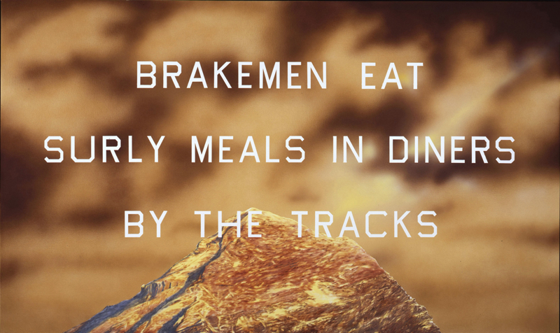
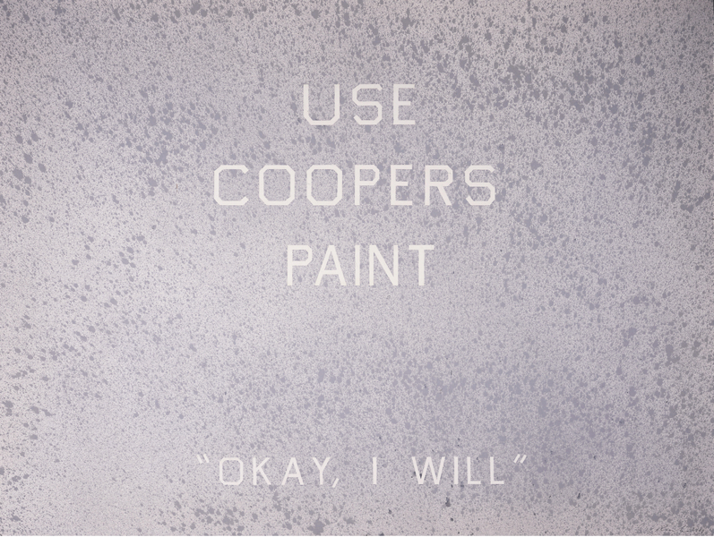
So it’s not unexpected that Ruscha would try to elucidate Jack Kerouac by lifting phrases from the novel and painting them in his signature-style: block print over nearly colorless, textured backgrounds, or vibrant hues with photorealistic images of mountain peaks along the bottom of the canvas.
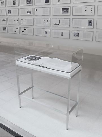
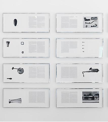
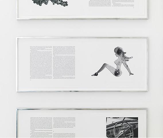
Other common objects of Western culture also play a significant role in the art of Ed Ruscha. These are evident in the limited edition artist’s book version of On The Road created by Ruscha in 2009. The book is 222-pages printed on Hahnemühle paper and illustrated with photographs taken by the artist, commissioned or found. The photo plates are all blind embossed and tipped in by hand. An unbound version of the book, double-pages framed for display, is on view at the Denver Art Museum in Ed Ruscha: On The Road. Installed in an elegant grid at one end of the gallery, the rest of the space features 15 related paintings.
“If you weren’t familiar with the lines from Kerouac, you wouldn’t just know the source,” Thomas Smith, director of the Petrie Institute of Western Art said as we toured the exhibition. “You would think it was just Ruscha pulling literary verse out of context. At the heart of what Ruscha is, he’s a pop artist. In sort of the Andy Warhol sense of grabbing soup cans and images that are in popular culture, Ruscha is grabbing language that’s part of, and has become central to, popular culture, and the American story.”

Ruscha uses an all-caps typeface he invented, of curved letter forms squared-off, named “Boy Scout Utility Modern.” It’s his re-creation of the aesthetic of old-fashioned billboards and handmade commercial signs. And he knows something about this since he started his artistic career as a commercial artist. But it was his interest in words and typography that provides the primary subject matter for his paintings, prints and photographs.
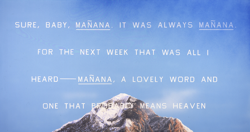
A brilliant blue Western sky is the background for Mañana a large painting that is near the center of the gallery. “Sure, Baby, mañana. It was always mañana. For the next week that was all I heard—mañana, a lovely word and one that probably means heaven.” The words “probably means” nearly disappear into a rugged, snow-capped mountain peak that juts up into the bottom of the painting. Ice-capped peaks protrude into an emerald green background on another painting across the room. “Greatest seventy-yard passer in the history of New Mexico State Reformatory,” written on the canvas. And in this one “reformatory” dematerializes into the peak.
The photo realistic mountains began appearing in Ruscha’s work in 1998, a few years after he created a mural for the Great Hall at the Denver Public Library. And an early example from the DAM collection is on view in a nearby gallery.
But even if one is unfamiliar with Ruscha’s background, his affinity for artist’s books, his inspiration found in language, one will find a link between his version of On The Road and his paintings in photography, which has played a crucial role throughout his career. His photographs typically feature deadpan depictions of subjects not thought of as having aesthetic qualities. This is evident in the imagery selected to illustrate On The Road the book. Like his paintings, most of his photographs are devoid of human presence, emphasizing the structure and its placement in a built environment. The same could be said of the phraseology in his paintings. His choice of words are straightforward while also being inscrutable. “The Holy Con-Man Began to Eat.” “Brakemen eat surly meals in diners by the tracks.” “Everything takes care of itself. I could close my eyes and this old car would take care of itself.”
And they are Western. Contemporary Western. Pop Western. Deadpan Western.